A boutique jam range created as a personal branding project exploring how premium food products can stand out in a crowded market through distinctive visual identity.
The Brief
This concept product needed to position itself at the high end of the jam market, targeting delis and specialist food shops. The challenge was differentiating the brand from typical jam packaging, which relies heavily on gingham patterns and literal fruit illustrations. The brand needed to feel refined and premium whilst still communicating the artisanal quality and unique flavour combinations of the product.
The Solution
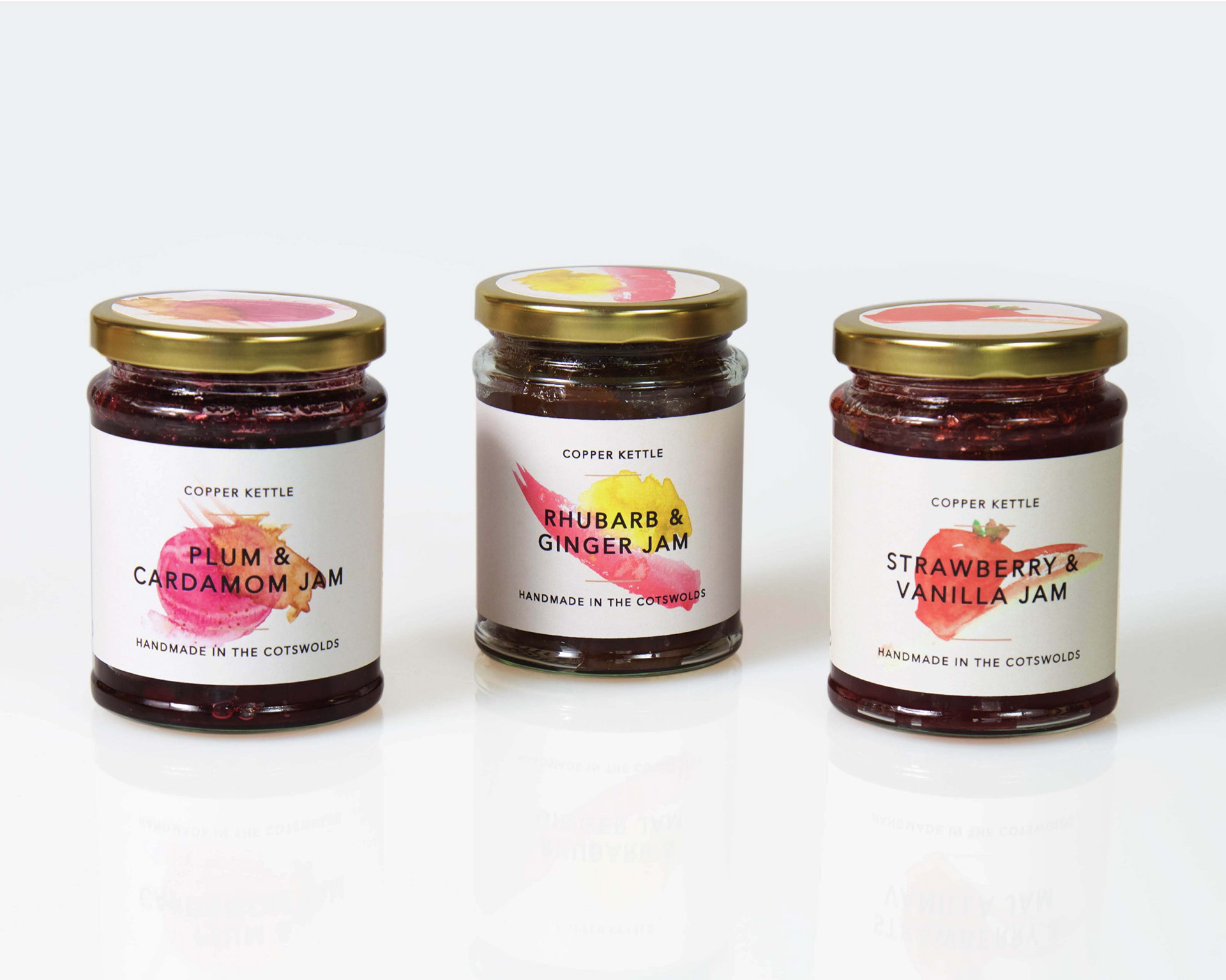
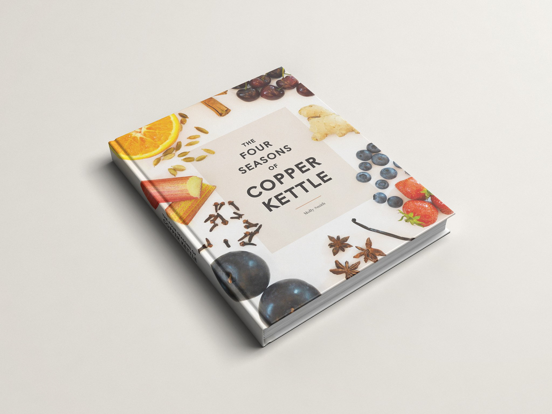
I created a series of abstract watercolour illustrations to represent each flavour combination, moving away from traditional jam packaging aesthetics. Rather than depicting the ingredients literally, the watercolours evoke the blend and harmony of flavours, creating an artistic, sophisticated visual language.
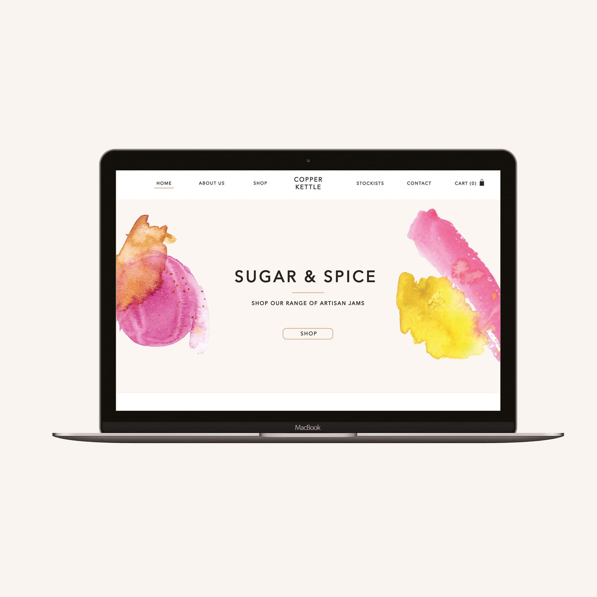
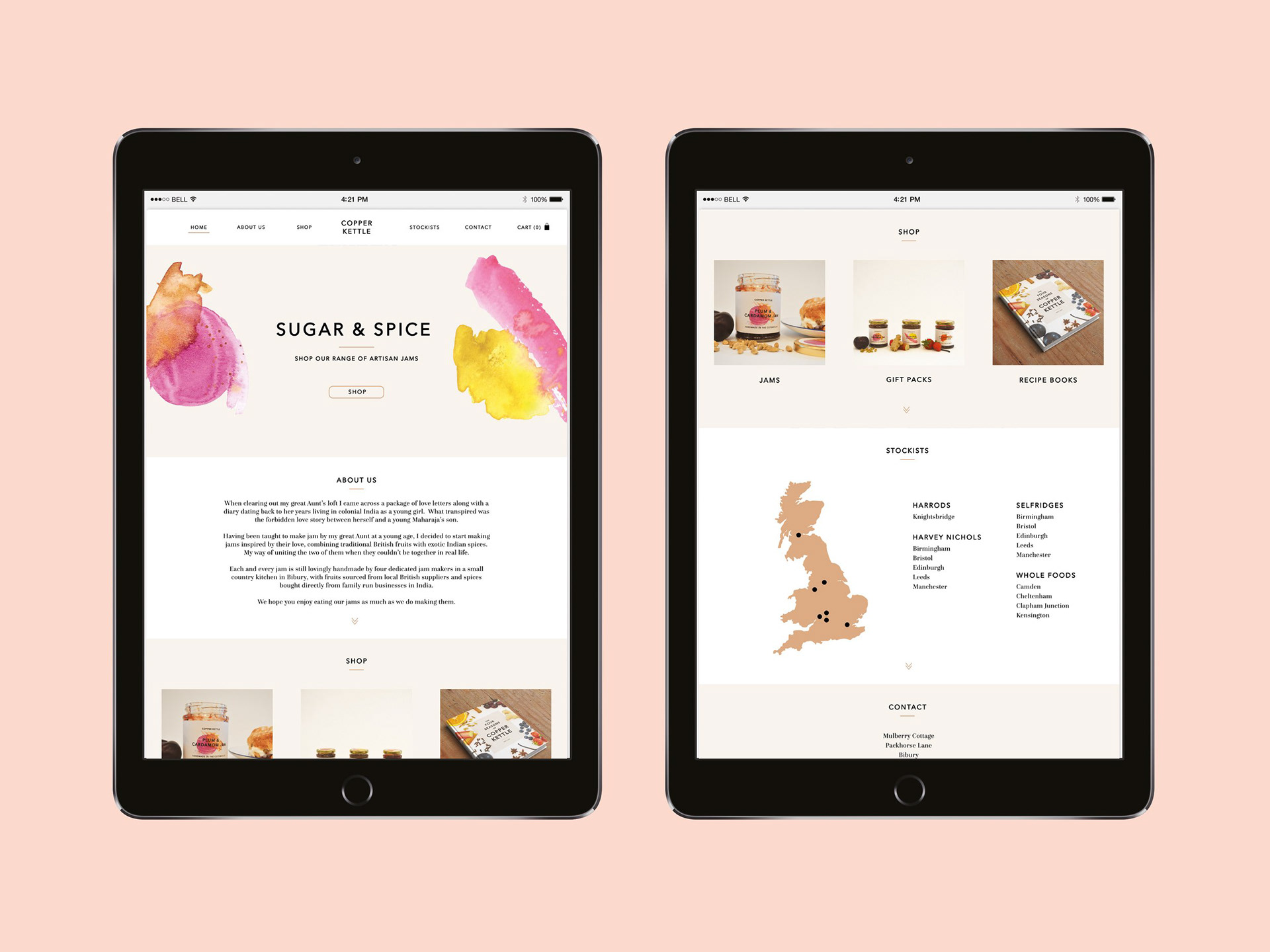
The illustrations are paired with a black and gold colour palette that creates a clean, refined look across both print and digital applications. This premium aesthetic positions Copper Kettle as a luxury product, appealing to discerning customers seeking something beyond mass-market preserves.
The cohesive identity system works seamlessly across jar labels, packaging, promotional materials and digital platforms, creating a distinctive shelf presence in specialist retail environments.